


It’s time to choose the next cover for Threads October/November issue (PS. It marks the start of our 25th Anniversary!) Help us by choosing your favorite image and cover lines in this brief survey.
This site is protected by reCAPTCHA and the Google
Privacy Policy and
Terms of Service apply.
See all newsletters


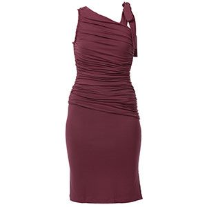


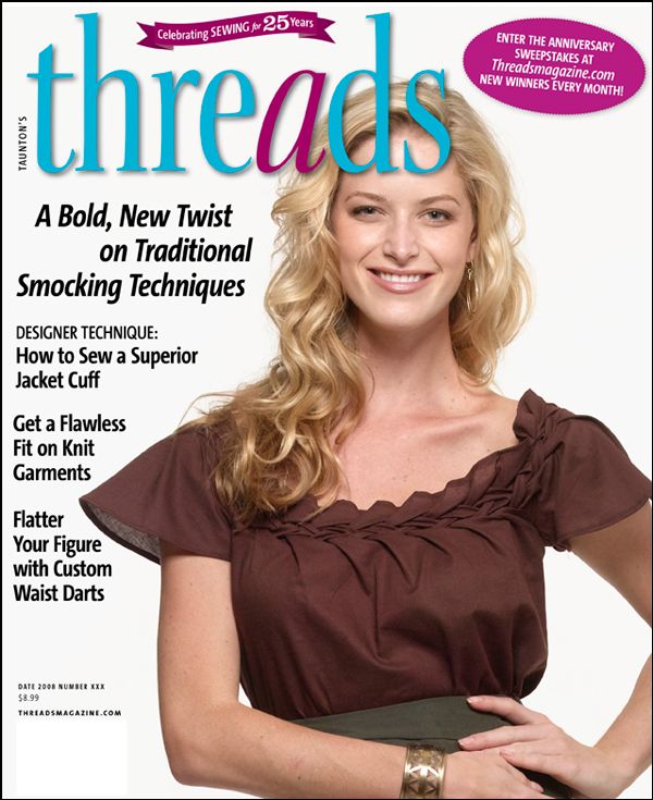
My vote is for #2----stunning!
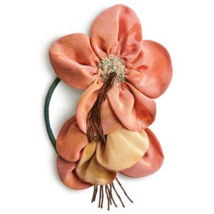
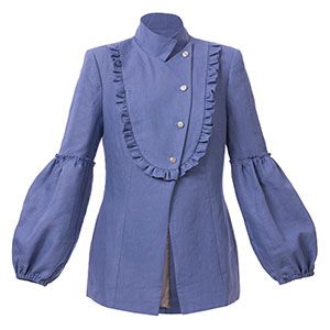
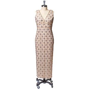
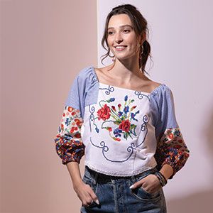
Photo with dress form; layout from 2nd with lace on model.
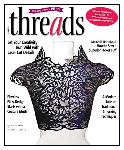
#3 is blah.
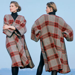
I would again point out that you don't need the comma in "Bold New Twist" in the text on the cover with the woman in brown. Someone at Threads really, really likes commas but doesn't know their proper usage. The proofreader at Fine Woodworking never slips up - maybe you folks should borrow him or her.
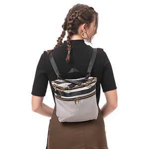
I love one and two. I Think two 'pops' more though!
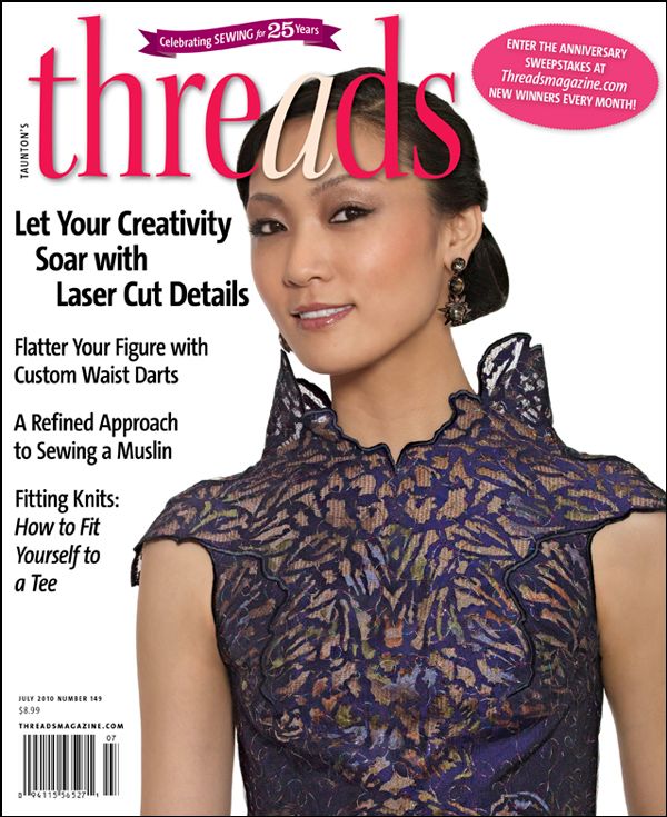
I like #1
I vote for #1.
I vote for #2
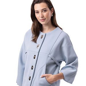
At first glance, my eye went to #1 but the headlines on #2 peaked my interest far more. And, the garment with a girl inside is quite beautiful.
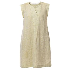
While the details of the garment shown on #3 are interesting the fabric color and type itself are seriously boring. I'm actually very interested in new smocking techniques but this cover wouldn't grab my attention.
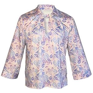
Hi, I like #2. I like to see how something looks on real people not on a dress form. Also the wording Threads in red looks best.
I prefer #1.
I like No. 1, followed by No. 2. The brown fabric of the garment in No. 3 is not eye-appealing, and the garment itself looks like part of a square-dancing costume.
I would like to take this opportunity to say: Please quit slathering your editorial models with soooooo much makeup. I often end up looking critically at their makeup jobs rather than duly admiring the garments they are modeling. Threads uses very flat lighting to show garment detail, but it makes heavy makeup look garish.
I like #2. I agree with annelizabeth that garment looks much better and live on the model than on a boring dressform.
My vote is #2.
I like #1, it simple yet pretty. My second choice would be #3
#3
I like the picture for #2, though there is too much white space on the right-hand side. I like the wording of the topics for #3 best.
I like the simplicity of number 1, my second choice would be number three.
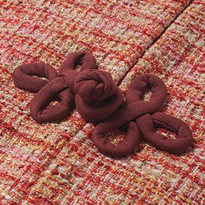
I really like number 3. The blouse detailing is great.
I really like the first cover with the dress form, there is something very striking about the image.
Most definitely, no. 2. The model makes the difference for the gorgeous lace top. Smooth layout. Great red lettering for Threads. Eye catching.
Love the smock work and will look inside to see it.
I really favor the front page were the beautiful form and texture of the blouse makes a strong and sculptural impression. There are female faces on most every womens magasin so this stands out I think.
Mirene
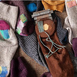
#3 because it is the essence of what the magazine started on all kinds of needle work. I still have some Threads magazine with a lot info on knitting,embroidery,sewing etc,etc. This will be a good way to remember how it used to be.
These cover will grab my attention.