

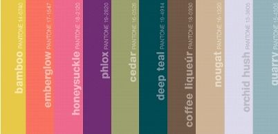
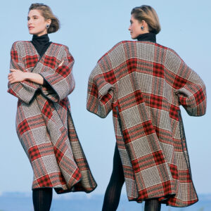
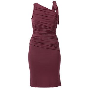
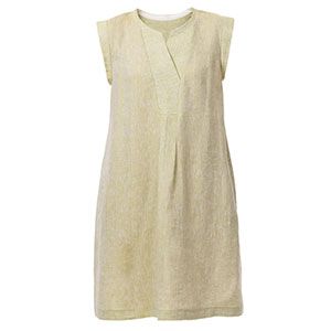
Pantone’s Fall 2011 color palette incorporates brights like Bamboo and Honeysuckle (the Color of the Year).
Every year, color marketers confer and evaluate trends to decipher the direction colors will take in the spring and fall seasons for everything from fashion to home accessories to paint colors. Gauging color trends is a fascinating process that draws on the insights of professionals and thought-leaders from many different industries and takes into consideration the influences of global events and societal moods. The process seems a little mysterious, but the resulting color forecasts are never dull.
As much as these forecasts predict the trends, there’s no doubt that they also drive them. There’s quite a bit invested in marketing a season’s hot color palette.
It’s sometimes difficult not to get drawn into the marketing and recognize a flash-in-the-pan color for what it is. Often I find myself considering the selected hues in a new light and sometimes incorporating them into my own sewing plans. Some colors I never would have considered previously seem to have new potential when they’re displayed with complementary hues, especially when they seem to show up in every store, catalog, design blog, and magazine. The more I see of a particular color, especially one I’ve shied away from in the past, the more comfortable I become with it. The marketing can wear down one’s resistance by repetition or saturation.
Take, for example, Pantone’s fashion color forecast for Fall 2011 women’s colors—a palette of brights contrasted against neutrals and softer tones. I’m not generally a fan of yellows and pinks, however bright and cheery they are, but Fall 2011’s Bamboo is intriguing. Honeysuckle still has to convince me, though.
As sewers, do you find yourselves drawn to the chosen color of the year and the season’s “official” color palette? Do you sew garments every season that incorporate the color trends? Or do you prefer to go your own way entirely and make projects only in those colors that please and flatter you? Any regrets?


I have a daughter who will wear any color as long as it is black, and a husband who generally keeps to blue-gray and denim. I wear blues, neutrals and salmon, but not together. We have a very boring washing line !
There's a lot to be said for this approach since new clothes match well with the old ones.
That said, I didn't know the colors for this year, and since I've seen them, I like them - is it because they have hit on all my favorite colors for once (except the yellow)?
I've always gone my own way, whether that be in style or color selection. I like what I like and I know what flatters me.
I'm drawn to, and look best in, clear saturated blue-based colors. So, while a few of this season's colors intrigue me, most are not likely to find their way into my wardrobe - especially not Bamboo. That one would turn my complexion to mud in a second.
If I absolutely MUST have a season's "it" color regardless of all of that, I usually go ahead and buy the fabric, but use it to make something nice for someone else...therefore, no regrets at all!
It used to be that designers and forecasters drove the trends, but consumers today—especially women—are too independent to buy what they don't like. Look at family photos from the 50s, 60s, 70s and 80s, and you'll see women with similar hairsytles and the same skirt length. It wasn't until the 90s that most women really began to define their own style, including color choice.
The fine balancing act of forecasting is to get the colors to the marketplace when the consumer feels a resonance to them. If the timing is off, the new colors are on the 70%-off shelf at the end of the season, and the manufacturer's gamble is painful. This Pantone palette has warm, cool, clear and muted hues, plus a neutral--something for nearly everyone. And several of these will be accessory colors rather than clothing --- bamboo and honeysuckle may be just the ticket for shoes, belts, handbags or jewelry to perk up a conventional wardrobe.
I've been interested in color ever since I was a very little kid, and love pretty close to every color there is. However, I've learned as an adult that I am not well-served by every color there is. As a "winter," my own natural coloring is enhanced by black and white and the brilliant jewel tones, including bright *lemon* yellow.
However, most of the colors portrayed above would make me look sick; especially the "bamboo" would pick up every wrinkle and flaw in my skin, besides throwing off the natural colors of my complexion. No way will I buy anything to wear that will do that to me! I'd rather look good in old clothes than acquire new ones that would make me look bad.
So no, I will not be wearing any of those colors in the 2011 lineup. Thanks...but no thanks!
Color is very important for self-confidence and self actualization. I choose colors that are warm, ranging from tomato-red to yellow and from their lighter notes in pastels to their base notes in browns. I am undone in the presence of blue undertones, blacks,and greys and must add some yellow admixture. Regardless of the "season's new" colors, I will select the offerings in my personal palette. My wardrobe builds from season to season with coordinating possibilities and gives me a put-together look.
I love these colors-well most of them. I would wear them. I wear what I like and what looks good on me but u can always wear the in colors or some shade of same!
"I know what I like and like what I know" - which sounds rather stodgy but seeing the annual "trends" colour schemes certainly gives me new ideas to try, even if it is only as trim or accessories. It would never have occurred to me that "Phlox" would add a bit of spice to "Quarry" for instance...
hh
I have clothes with all of these colors already. I believe that it is simply a matter of the specific colors coming to the forefront. I am more interested in the color combos that come out of the fabric designer's studios.
I know what colors look best on me. I enjoy using colors from a palette that are good for me and only use the others in ways that won't be obvious with my coloring. My mother always asked when considering the current style, etc., "Do you want to look just like everyone else?" She thought one reason to sew was to set your own style. However, she did let my best friend and I make identical dresses for a special dance.
I usually stay with colors that flatter me since I'm very fair and can't wear those luscious deep purples and fushias. I try to find fabric with maybe a touch of those colors and try to keep them away from my face for the most flattering look. I love lots of colors I can't wear so I have a purple billfold, a bright pink purse - try to enjoy those colors in accessories (shoes)etc. Although it can be depressing when I want to shop for something ready to wear and the whole store is nothing in my color! That's one reason I sew!!
I use my Summer Colour Palette picking the colours closest to the 'new seaon'. Until I saw this article I didn't know that Honeysuckle was pink and I already have this in my wardrobe!
I usually choose fabric colors based on what I like and know looks good on me. I do take note of the forecasts, but it doesn't hold a lot of pull on me as to what I wear. Sometimes, you can use a shade lighter or darker of the forecasted colors to make it work better for your skin coloring.
To update my look, I like to add at least one of the Trend Colors to my wardrobe plan. I look at how bright or subdued a color is more than the Personal Seasonal Color Palettes.
My biggest problem is finding the trend colors in the correct shades and tints in the US retail fabric shops, like Jo Ann Fabrics or Hancock Fabrics. If I can come close to the color, I still cannot find the fabrics to coordinate with it. Is this a common experience? Any solutions?
I have to stick with jewel tones of the purest kind. Anything that is too light/pastel-toned/odd-toned just doesn't feel right. I am too self-conscious to wear things like bamboo and teal.
However, if I like a color that isn't in my usual palette, I can choose to make a drawstring casual purse in that color or even a sash belt.
And even more, I sew for dolls. The colors of this year's palette look great on my creations.
I stay with the "Spring palette" and cheat into the Fall Palette for winter fabrics. I have made to many mistakes in my life to buy some trendy fabric because it is the 'in thing'. I always feel better sewing on fabric that I know will compliment me.
I learned a long time ago to use the colors that flatter me. I end up with a much greater selection to coordinate in my closet than making choices that are "this year's colors." My "neutral" is dark navy most of the time. I also have some black, but prefer not to use that by my face. Black doesn't flatter most women's complexions. I add reds, wines, pinks, citron, and naturally whites and creams with dabs of brown now and then. I have used this palette for years and it gives what I wear "my signature." It's easy to have all the appropriate accessories also. "The latest palette is just a way to sell more clothes, etc. You look best in your own colors and style!
After years of playing with fabrics and threads I have developed the confidence to know both the colors and the styles that are flattering to me and those that are not. I dress to please myself and not some fad or trend dictated by someone who does not have me in mind. It's discouraging to shop the years the colors are "muddied" but I find as time goes by there are more choices available.
I tend to wear colors that are more flattering to my skin type. Honeysuckle, emberglow. and nougat are colors that would fade in my skin color. I like yellow but it needs to be darker. Colors do affect my moods. I feel more vibrant in a red dress. I am a true primary color person, don't like colors mixed with black like burgundy. I do like pastels though.
This reminds me of a 50's and 60's palette, and even as a small child I didn't like it the first time around.
Also, this colour palette would look awful on me except for Phlox. I just feel unwell looking at it in its entirety. Maybe some people could use this as an inspiration - but not me. Anyway, why should I wear colours that are chosen for me?
Colour is very personal, so I feel that we should just follow our instincts and just wear what makes us feel great -regardless of any trends forecast. We should not conform or give in to mass marketing - just be ourselves. Isn't that why we sew? Did we not learn anything in the 60's, and beyond? By the way, Fashion experts love individual style precisely because it is not mass-produced...
Since the computer monitors can often change the color, is there a way to get a sample of the colors? If yes, how do I get the image large enough to read the numbers?
I found the Pantone samples. They are too expensive for the small use I would make of it. http://www.pantone.com
I like color forcast because it gives me an idea of what I will find in the fabric store. It puts my subconcious designer to work. Oh goody! There will be some lovely teal prints this year. Some years, certain colors just are not available so I have to dye and embellish to get what I want.
Color forcasters should take note from these comments. Creative sewers buy what they like.
I do wear colors that flatter me, but I get excited about seasonal colors where I can add asesories to an outfit, make a new pillow cover, and spruce up myself and my house with something fresh. I like honeysuckle, phlox teal and quarry. Since I live on the SC coast, bright colors are always in.
I stick with colors that flatter me. I get tired of being jerked around by the fashion industry. Change for the sake of change is irritating and wasteful from my point of view. If the season's colors include something that works with my coloring and that I like, I may include it.
I have access to forecasting reports and could check if I wanted, but I don't care.
And Black is always flattering, slimming, and never out of style.
I'm with Sewcietymaven...This is Pantone's industry...They have to come out with something new every year...What would it be like if they had nothing to show us. There would be 25 fewer posts here for one. I have been sewing for many years and trust me...I'm sure I have every color under the sun...solids and prints. Pretty sad if we never had something "fresh" to look forward too...even if all these colors have been around FOREVER. Just like everyone else we are all drawn to our favorite colors...they will never go out of style...The style might though.
For me, color is a personal choice. I do however, love to see what the "designers" have come up with season after season, colorwise. When purchasing clothing styles I try to find items in colors that I love or at least that look flattering on my skin tone.
I tend to choose fabrics in teals, chocolates and taupes so I was glad to see these incorporated into the Fall 2011 color line. Choosing a color I love to wear is very important to me as it can influence my mood either for the good or the better.
It's interesting to see this season's palette, however, I usually just ignore these things and wear clothes that go with my skin tone, regardless of what's "in." For me that's yellows, oranges, browns, olive greens, reds (no blue undertones) etc. No pink or blue (except jeans) or pure white. Some years I can find lots of clothes in my colors, others, not so much. It looks like this year there will be clothes I can wear, although I'm watching my spending so probably won't add much new stuff. However, I do have a fabric stash I can dip into, and really need to get back to doing more sewing.
My biggest distress is trying to match thread colors for garments made in years past. I own a lot of thread of dubious vintage/strength, just to be able to alter and repair older clothing. Yes, new palettes are fun, but whew!--a lot to keep up with!
As a seamstress of many years experience, and a 'rugged individualist', I don't pay attention to 'the colour forecasts'. I know only too well which colours flatter me, and stick pretty much with them.
Other peoples ideas of what is 'in' have never been much of an influence on me. That being said, if one of the in colours happens to already be in my 'palette', I will use it!
I guess I am one of those throwbacks who refuse to follow trends, and was always out of step with the times at school!
Vive la difference!!
Oh - come - on. What color exactly is "emberglow" or "quarry"??? Some made up name for shades of orange and blue. I understand that Pantone needs to justify their existance by coming up with a variance on the color wheel every year. I can see them sitting around the conference table now trying to create a new word for "yellow" or "red." "Nougat" was khaki for years and "coffee liqueur" was brown. I guess you can tell that I don't subscribe to the "IT" color of the year. I'm a spring and stick with those colors/tones/shades that flatter me. I have plenty of fabric in my resource center (sounds better than stash) that suits my needs. Just like my skirt length - I go with what I like and not what some designers decide.
As so many others I also use colours that flatter me. However I do check out what is in fashion and see how I can incorporate one that really appeals to me. In fact, it also gives me a nudge to sew something new and update my wardrobe so it is somewhat predictable but never dull!
I dont consider colours as being "in" or "out", provided they suit me. If the colour doesnt suit, (ie: yellow based colours), then it is definately "out" regardless of fashion trends.
I tend to stick to the clear blue-based Winter colours that suit me best. The darker colours are very stunning: royal blue, cobalt, teal, blue based reds, emerald and blue based greens, black, greys, ivory, white, an occasional pastel, darker purples and bright fushia pink.
It is nice to know Deep Teal is "in" again this season... as there is 6m of deep teal Shantung in the stash!
Generally my reasoning is... Unless the current colours and fabrics grab me as a wow! MUST HAVE NOW!...
Why pay full price for perfectly good fabric just because it is "in", if you can get the same fabric for so much less when it goes "out"??
It is still perfectly good fabric.
Like the dark chocolate brown Melton wool... when "in fashion" it was nearly $40 a metre. "Out" of colour fashion it dropped to $4 p/m on clearance; the Shantungs dropped to 50c a metre!
This may be "out" of step with colour fashion, but it is very exciting shopping! You can still look stunning in your colours.
Regrets? None. It is so much fun finding "my colour" specials!
I wouldn't wear those colors. They are beautiful, but not on me. This is the beauty of sewing: when ready-wear trends are not to my personal stylings and tastes, I can create my own wardrobe that complements me to my greatest advantage.
Like most, I stay with the colors that flatter me. I don't have to use the new, seasonal ones for my basic palette, instead using them as accents or for alterations to my existing wardrobe or for home decor and various craft projects. But I also anticipate the new color trends because they feed my creativity. I find combining colors sometimes changes not just the personality of my project but the tone also, leading to even more ideas. Here in the Pacific Northwest, colors for ready-to-wear tend to run in the muted tones, like the ones in the right half of the above palette, and not MY best colors at all. (I call them dirt colors). So it's a bonus to see what's coming up: I can do some great planning.
I do keep track of each season's colour forecast as I know that thread, buttons, zips, and trim for those colours will also be available in the stores, sometimes only for a limited time. If I do buy yardage in any of the colours, I make sure to purchase matching notions just in case I don't get it made up right away. I only buy clothes or fabric on a replacement basis, as I have a stash big enough to last me the rest of my life! It's also fun to incorporate touches of the prevailing trends into my wardrobe but in doing so, I always stick to the colours that I already know flatter me. Quarry, Orchid Blush and Honeysuckle will definitely find their way into my wardrobe this fall.
I had my colours done over thirty years ago by a brilliant woman who set me on the right colour path. The only colour I wear frequently that I know looks terrible on me is black, but I wear it for practical reasons and have figured out a few tricks to make it look less harsh: if you can't keep it away from your face, make sure to choose your best neckline shape, wear a slightly brighter lip colour and/or blush, and try a scarf or jewellery in one of "your" colours.
As someone already commented, colour is intensely personal but apart from being "free" (it comes with every item we sew, make or buy), surrounding yourself with the right colours can enhance your life, your family's life and the life of your children.
very nice stuff loved it all the way
its awesome
Yes I like it
This is nice design
its soo nice.
Multicolored sweet.
Friends now you can share you ideas with someone on