


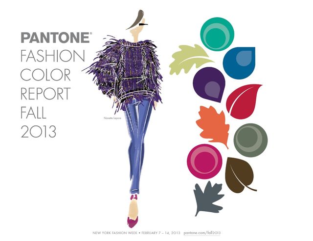
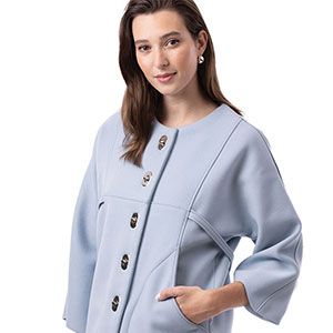
The Fall 2013 Fashion Color Report is full of rich, sophisticated colors for women and men.
Every year, color marketers evaluate trends to decipher the direction colors will take in the spring and fall seasons for everything from fashion to home accessories to paint colors. The science of color is fascinating, and the colors that are used each season by fashion designers have been carefully chosen by the color industry to reflect societal moods, global culture, and even economic conditions.
For fall 2013, for example, the fashion color palettes reflect consumers’ desire for versatility and variety, according to Pantone, a global color authority. Each spring and fall, Pantone surveys fashion designers about their use of color to develop its seasonal Fashion Color Report.
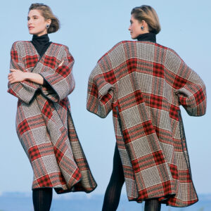
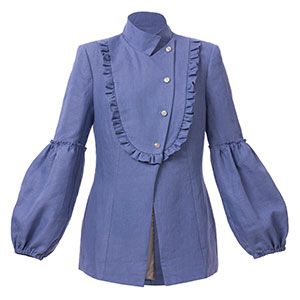
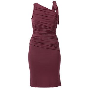
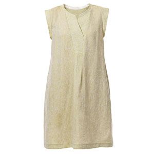
The Fall 2013 Fashion Color Report shows that colors for women and men range from sophisticated to lively, offering the stability of strong base colors and neutrals alongside expressive, vivid tones. This season’s palette also skews toward gender neutrality. All but one of the colors in the women’s palette shows up in the men’s palette, where it was replaced with a less overtly floral and feminine color.
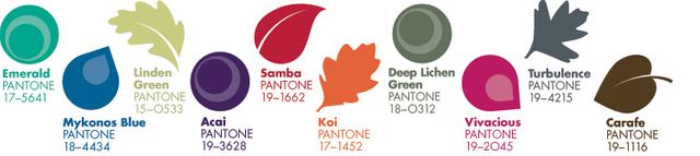
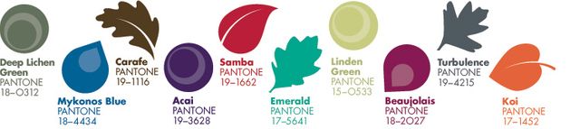
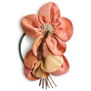
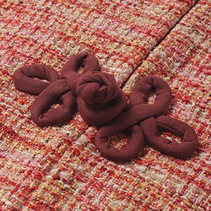
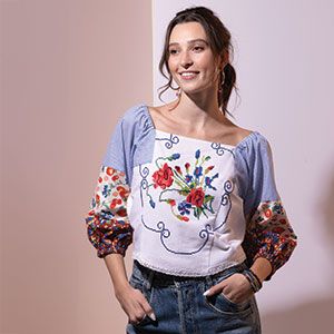
The top 10 colors for women this fall are: classic and luxurious Emerald green; yellow-toned Linden Green; bold, meditative Mykonos Blue; rich and exotic purple Acai; vivid Samba red; soft orange Koi; the deep fuchsia of Vivacious; misty, mossy Deep Lichen Green; stormy-gray Turbulence; and the sepia tones of Carafe brown. The same colors comprise the men’s palette–all except Vivacious, which is replaced with rich wine-colored Beaujolais.
You can be sure that the colors used so powerfully on fall runways have also been employed by fabric designers and that fabric store shelves (and the virtual shelves of online retailers) will be well-stocked with offerings that draw on this palette.
Personally, I quite like the fall palette, and I’ve already purchased fabrics in a few of these colors, which happen to be some of my favorites. Like many Threads readers, I buy fabrics in colors that appeal to me and look good on me regardless of the season or the current color trends. This season is just a happy coincidence. But sometimes, a color I never would have considered shows up on the palette and sparks my interest; it takes on new potential and fuels my creativity. As a sewer, I’m very much driven by color. I can’t fathom limiting myself to a narrow palette of choices–I want color: rich, luscious, glorious color! Granted, those colors have to look good on me, but beyond that, the sky’s the limit.
How do you respond to color trends? Do you find yourself reconsidering colors that you resisted at first after seeing them repeatedly in the marketplace? What do you think of fall’s unisex palette?


I buy what look good on me. Not necessary what everyone is wearing. Exception white and bright colors out of season