

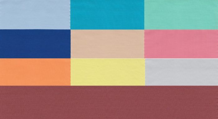
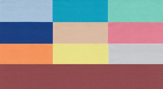
The women's spring 2015 color palette, left to right: Aquamarine, Scuba Blue, Lucite Green, Classic Blue, Toasted Almond, Strawberry Ice, Tangerine, Custard, Glacier Gray, and Marsala, the color of the year.
It’s still cold and snowy in many parts of North America, but at least we can look forward to fresh spring colors in our sewing. Lucky for us, Pantone has released its Spring 2015 Fashion Color Report to tell us all about the top 10 colors that fashion designers used in their spring runway collections. While no one can you tell you what colors look best on you and what you should sew, we’ll be seeing these colors all spring and summer long in retail clothing shops and fabric stores, sprinkled among the more standard seasonal hues.
The top 10 fashion colors for women this spring are:
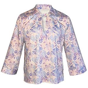
Airy, ethereal Aquamarine
Tropical, playful Scuba Blue
Soft, serene Lucite Green
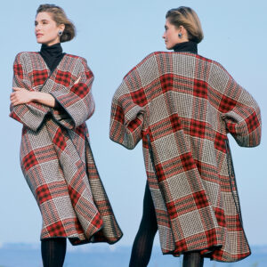
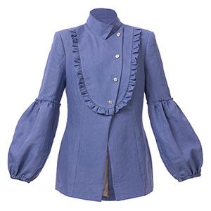
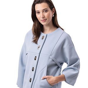
Bold, refreshing Classic Blue
Warm, glowing Toasted Almond, which functions as a neutral
Coral-infused Strawberry Ice
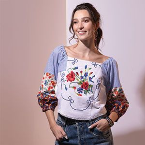
Energizing Tangerine
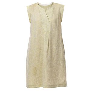
Yellow-tinted Custard
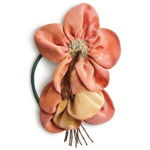
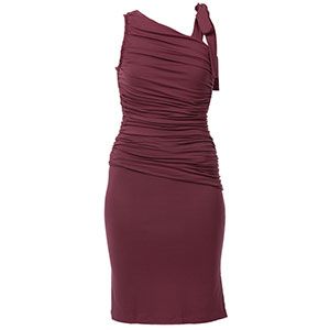
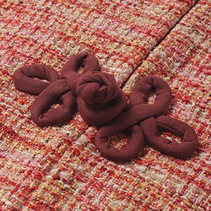
Red-brown, rich Marsala–the color of the year
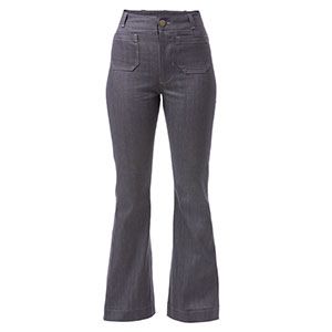
Relaxed, unobtrusive Glacier Gray, another neutral
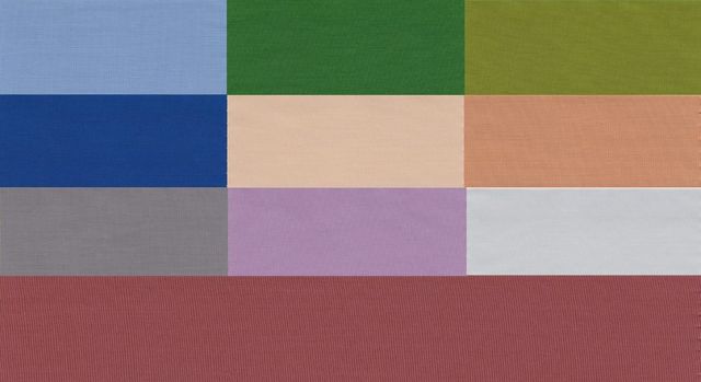
For the first time in several seasons, the men’s palette deviates from the women’s by more than one or two colors. This spring’s top 10 men’s fashion colors are:
Cool, calm Dusk Blue
Quiet Glacier Gray as a neutral
Fresh, summery Treetop
Bold Classic Blue
Warm Toasted Almond, again as a neutral
Olive-green Woodbine
Peachy-beige Sandstone
Strong, steely Titanium
Rich Marsala
Retro-inspired Lavender Herb
According to Pantone’s researchers, this year’s spring palette reflects a growing cultural need to disconnect from technology and seek calmness and introspection. Whatever the reason for the current color trends, these soft, cool hues and subtle warm tones combine into a fresh, minimalistic palette that takes its cues from nature.
While I find them all pretty and generally appealing, the only ones that really speak to me are Lucite Green and Scuba Blue. I look at them and daydream about strolling on a sunny, tropical beach wearing filmy, flowing clothes in vibrant colors. (It may be the first day of spring, but it’s snowing here in Connecticut, and tropical dreams will get me through the last bit of winter.)
Do you like any of spring’s colors? Will you be seeking them out to sew your spring/summer wardrobes?


Not so enthusiastic about this palette. The blues, green, and gray are okay, but frankly, I detest custard and marsala. Personally, I would look sickly in either & I just can't see either of these last two colors being too popular.
Oooh, I love the marsala! Blues and most greens are not in mhy personal color palette, but reds are perfect. I probably wouldn't wear marsala in the summer, tho. It is too "hot" for my taste. As a fall or winter color, it is great.
I don't like any of the colors. I think they are all to drab for Spring. I would like most of them if they were brighter shades. Honestly I don't care who claims to be the 'word' about Spring, or Fall (or any season) colors. I want to be myself, not follow whatever trends there are.
I don't like most of these colors. I hate that someone "tells" us what colors to wear. I won't look for any of these colors.
I don't like most of these colors. I hate that someone "tells" us what colors to wear. I won't look for any of these colors.
I am already seeing tangerine and custard in JCPenney in spring florals. And aquamarine is the field for their new floral pant in large sizes. It looks much better in practice than as a pile of paint chips. Look here for some suggestions on how to use these colors: https://sewandso.wordpress.com/2015/01/09/how-can-i-get-pantone-lucite-green-to-work-for-me/ https://sewandso.wordpress.com/2015/01/09/what-about-marsala-how-much-is-too-much/ https://sewandso.wordpress.com/2015/01/11/what-if-i-dont-have-the-exact-pantone-color/
I only care for aquamarine. The rest are either unflattering to my skin tone, or are just BORING!!!!! Very disappointing!! Frankly, I wear what looks good on me - unfortunately, this color chart limits what I can buy.
While there may, somewhere in the world, be a redhead or two who can wear it successfully, orange (in my opinion) should be limited to citrus and never used in clothing for humans. I prefer, and look reasonably alive in, soft and grayed colors: slate blue, sage green, mauvey rose. I do not wear yellow, black, stark white, orange, or any of the other colors shown in this palette. Just one more reason to stay out of clothing stores, I guess, unless I don't care that I look as though someone forgot to bury me!