
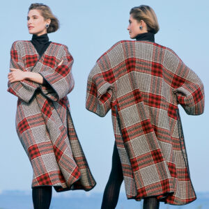
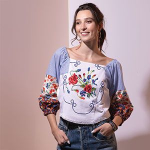
Fall 2016’s Strong Color Palette

Many runway designers focused on dark, shadowy colors, evoking a somber mood for their fall 2016 fashions, while others depended on pale neutrals for a meditative mood. But Pantone LLC’s Fall 2016 Fashion Color Report tells a different story. The rich hues of nature saturate the upcoming season’s palette, according to Pantone.
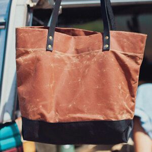
The fall palette downplays the typical brown-based earth tones in favor of calming blues, confident reds, stabilizing neutrals, and playful accent colors that together exude tranquility, strength, and optimism, according to the color group. Just like last fall, the selection of colors is non-gender-specific.
According to Pantone, the blues in the palette represent constancy, grays reflect stability, reds express confidence and warmth, and the hot pinkish-purples and spicy mustard-yellows suggest exotic flavors.
Here are fall 2016’s colors:
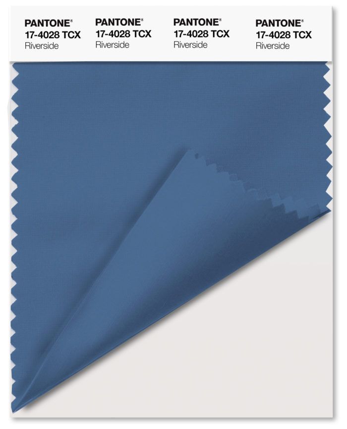
Riverside (Pantone 17-4028)

Cool, calming, strong, and stable, this blue is subtly vibrant and sophisticated.
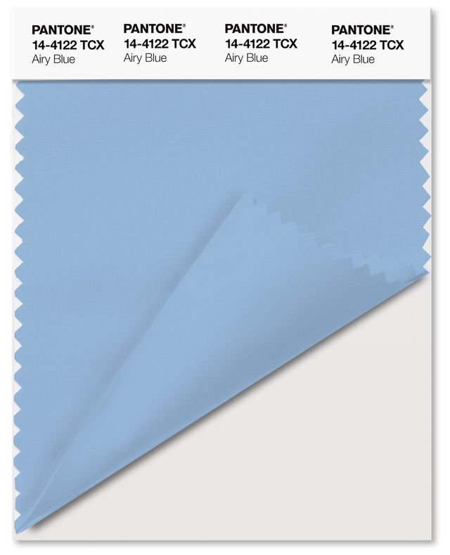
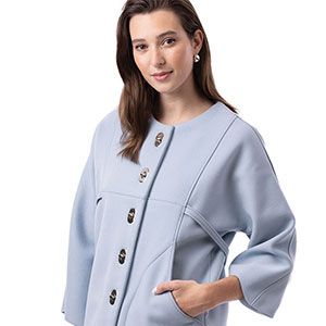
Airy Blue (Pantone 14-4122)

Light and serene, this pale blue evokes feelings of freedom and weightlessness.
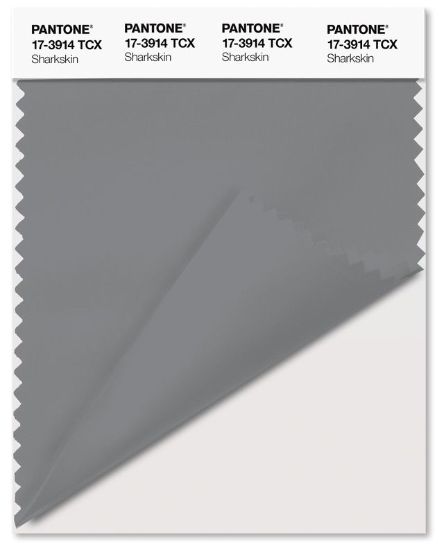
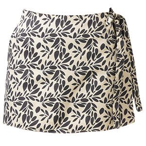
Sharkskin (Pantone 17-3914)

This restful neutral has an edge and pairs with nearly any other color on the palette.
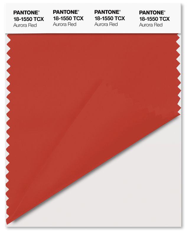
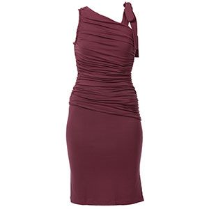
Aurora Red (Pantone 18-1550)

This bold, punchy red is warm, sensual, confident, and adds an exciting element to the palette.
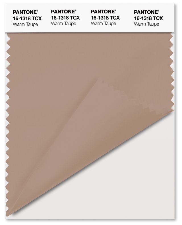
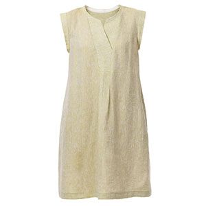
Warm Taupe (Pantone 16-1318)

Rich, hearty, and pleasing, this neutral suggests stability and timelessness, and it pairs well with the other colors on the palette.
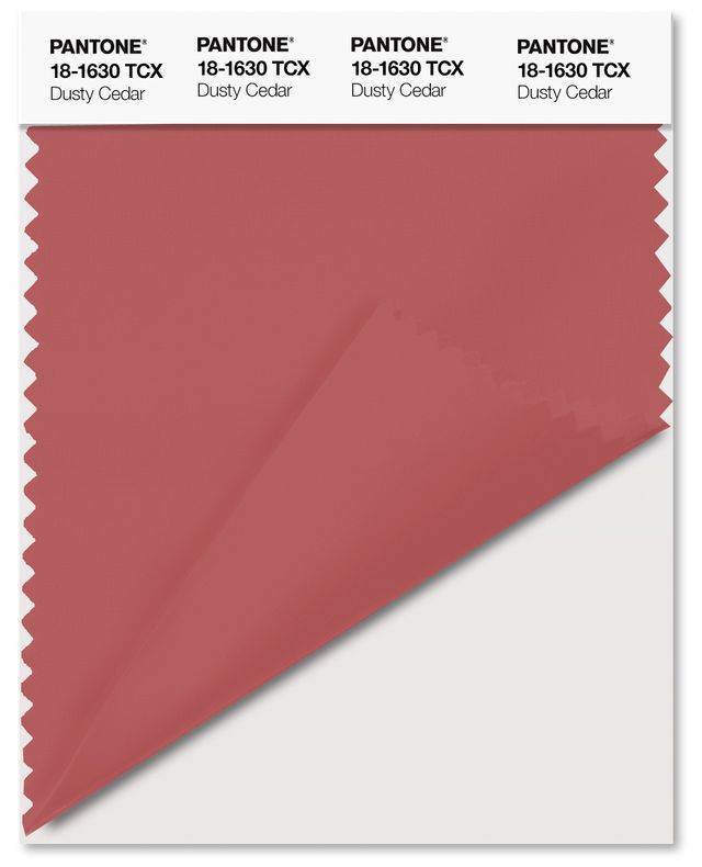
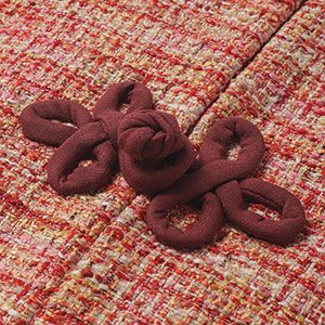
Dusty Cedar (Pantone 18-1630)

A darker shade of Pantone’s Color of the Year, Rose Quartz, this complex pink is warm and welcoming.
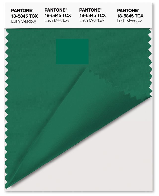
Lush Meadow (Pantone 18-5845)

Fresh, vibrant, and sophisticated, this green infuses the palette with rich elegance.
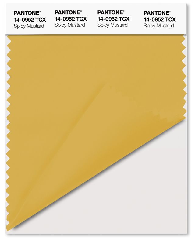
Spicy Mustard (Pantone 14-0952)

Hitting an exotic note on the palette, this vibrant, zesty yellow plays in unexpectedly pleasing ways off the other colors.
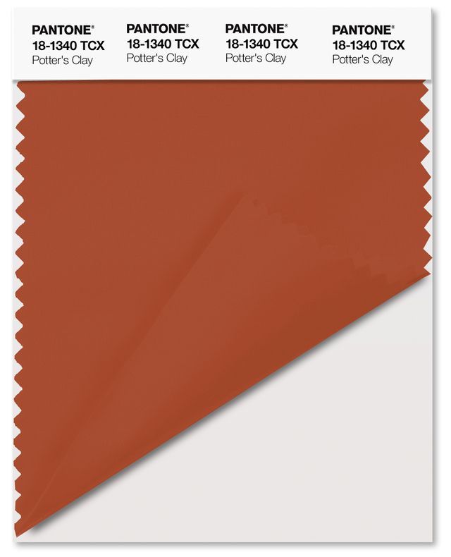
Potter’s Clay (Pantone 18-1340)

With undertones of russet orange, this terracotta tone is grounded and provides a strong foundation for the rest of the palette.
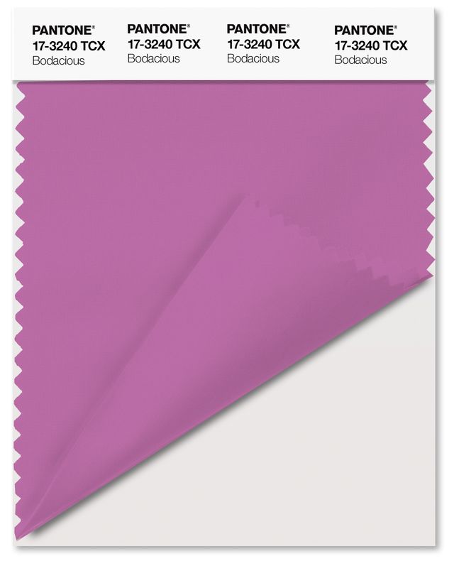
Bodacious (Pantone 17-3240)

Related to last year’s Vibrant Orchid, this intense purple-pink lends itself to vibrant color combinations and is versatile enough to pair with other pinks and reds.
So, are there any colors in Fall 2016’s palette that you’ll incorporate into your sewn wardrobe?


I like the shades of blue as part of the Fall 2016 colors. I have a lot of blue outfits, because my sorority Sigma Gamma Rho colors are royal blue and gold.
I'm glad to see the blues! Some of us just cannot wear traditional autumn golds, yellows and oranges.