Personal Print Selection | Web Extra
An image consultant shows which prints work best for a variety of hair and skin tones.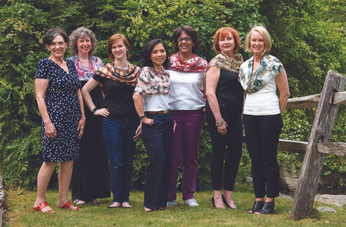
Sewers love a gorgeous print fabric. Having a closet full of beautifully patterned garments seems like a wonderful goal. However, too many prints—especially prints that don’t suit you—can be more of a problem than a benefit. Image consultant and wardrobe-building expert Nancy Nix-Rice says it’s better to a few perfect prints than many that don’t flatter you ideally.
In her article “Find Your Prints,” in Threads #205 (Oct./Nov. 2019), Nancy explains how to determine “points of connection” between your own physical features and a print fabric, for the most appealing and flattering look. The idea behind this is the design principle of repetition, and the result is a garment that enhances, rather than distracts from, your looks. According to Nancy, the best compliment is not “I love your dress,” but instead, “You look fabulous!” With the right print selection, that’s what you’ll hear.
Nancy spent a day with staff and friends of Threads, choosing prints to enhance each woman’s looks. A selection of these are shown in “Find Your Prints,” but there are many others we didn’t have room to share in print. Let’s take a look at this expanded range of images, with Nancy’s comments.
Kami
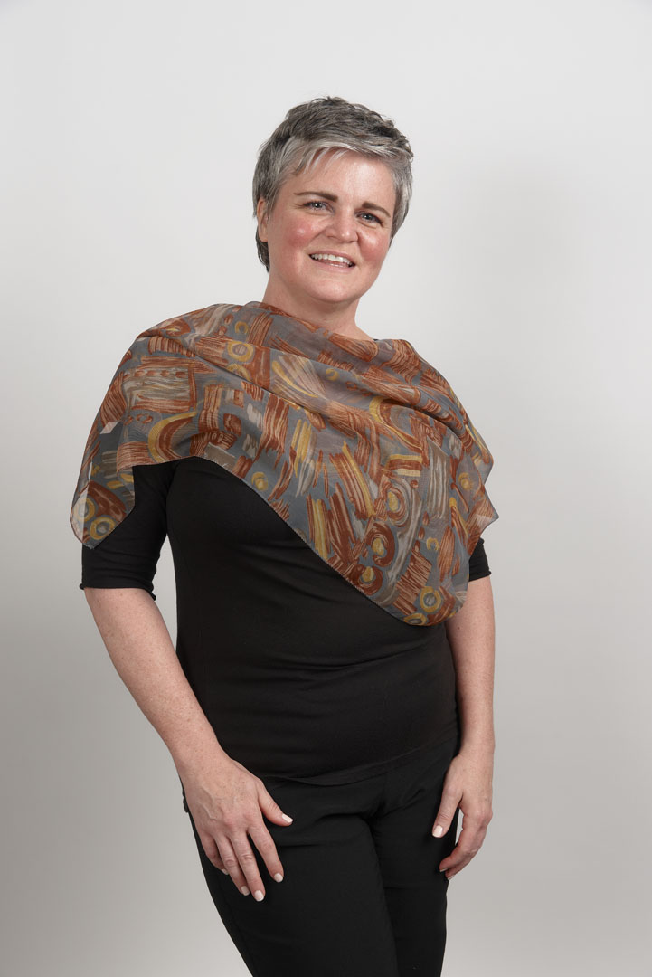
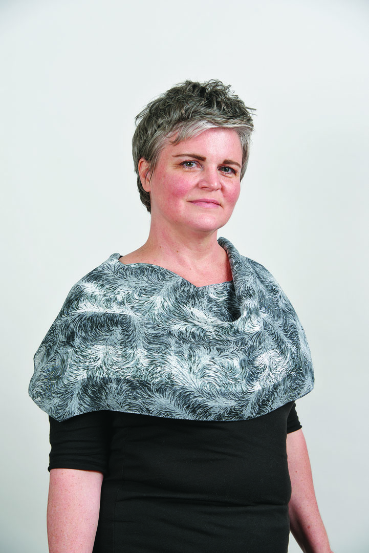
Kami has beautiful silvery hair, a deep eye color, and a fresh, youthful skin tone. This is a striking combination that really shines in the right print.
The gray background of this organic print is a good match for her hair, but the rust and orange motifs are too warm for her skin tone.
The fine, variegated print in silvery gray, black, and white repeats Kami’s hair color beautifully and gives a sophisticated, subtly textured appearance.
The light and dark grays reflect Kami’s hair, and the berry tones bring in some color interest. They are cool enough, and the darker berry colors reflect the deep, intense look of her eyes.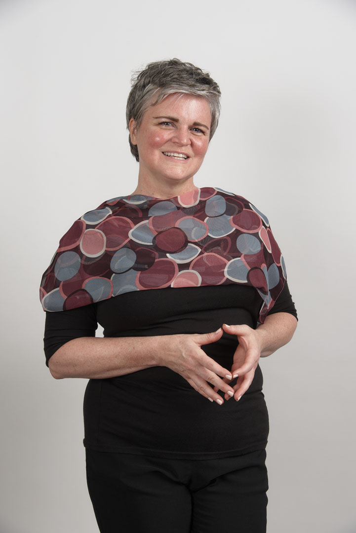
Maureen
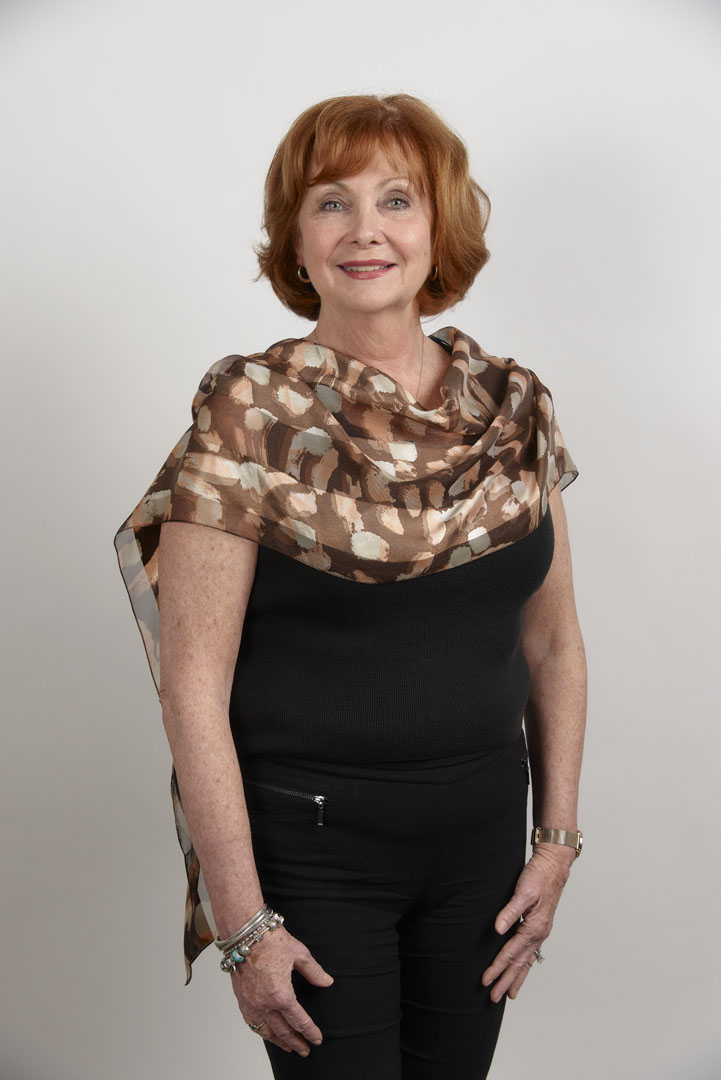
Maureen could successfully wear any of the three prints shown. They are shown in a ranking of good, better, best, but all are attractive on her.
The russet and sage green hues in this print are a pretty match to Maureen’s auburn hair and green eyes, but the print has a slightly too strong textural effect.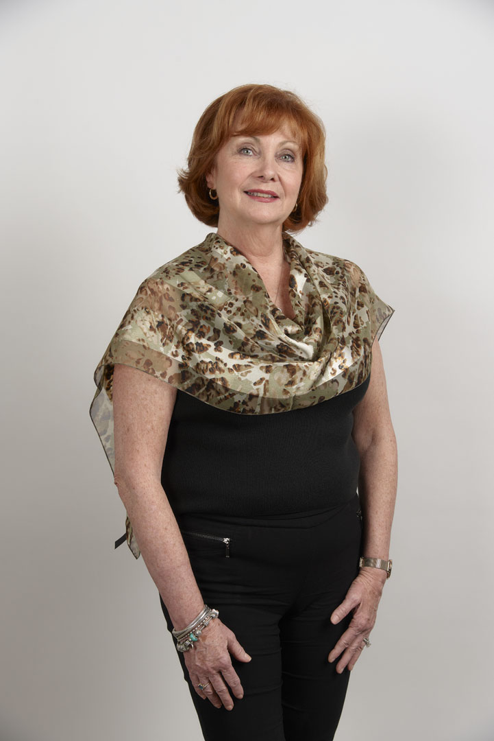
This soft print on a sheer fabric includes her hair color and reflects the curved lines of her hairstyle, but the overall print is too dark for her personal color value. It creates a “floating head” effect.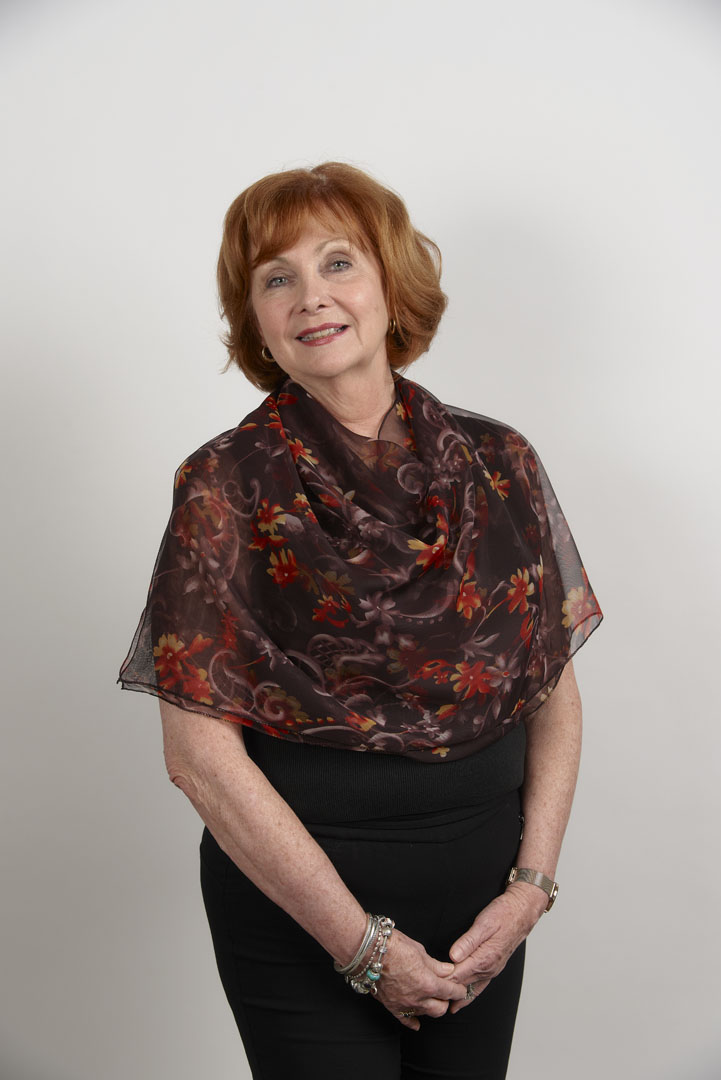
All Maureen’s colors—hair, skin, and eyes—are included in this abstract print, and the contrast level is ideal for her.
Barbara
Barbara has fair, warm-toned coloring, with blue-green eyes. While light blue prints seems like an obvious choice, accentuating her warm hair and skin colors is a better choice.
This combination of coppery rust, white, gray, and chocolate brown is surprisingly better than expected. The colors are somewhat warm, but the overall dark value is too heavy for Barbara.
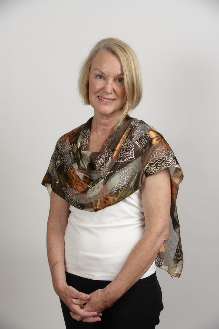
The same print in a much paler colorway balances Barbara’s skin and hair colors and value.
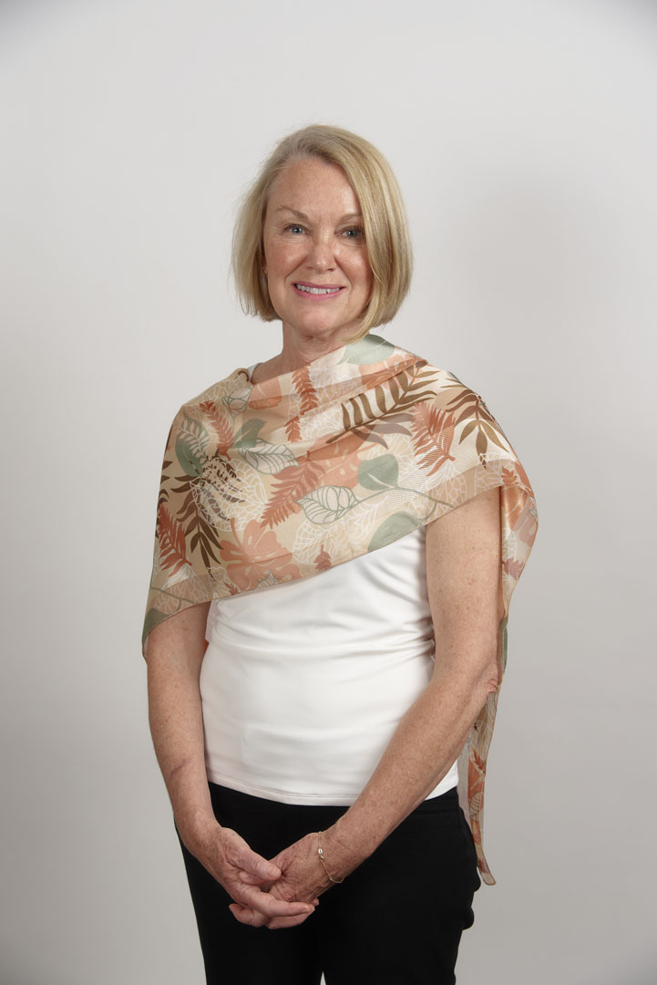
A print with some light beige, creamy pinks, soft white, and dark green really brings out her eyes, skin, and hair. The print motifs’ soft, watercolor effect reflect her hair shapes and highlights.
Erica
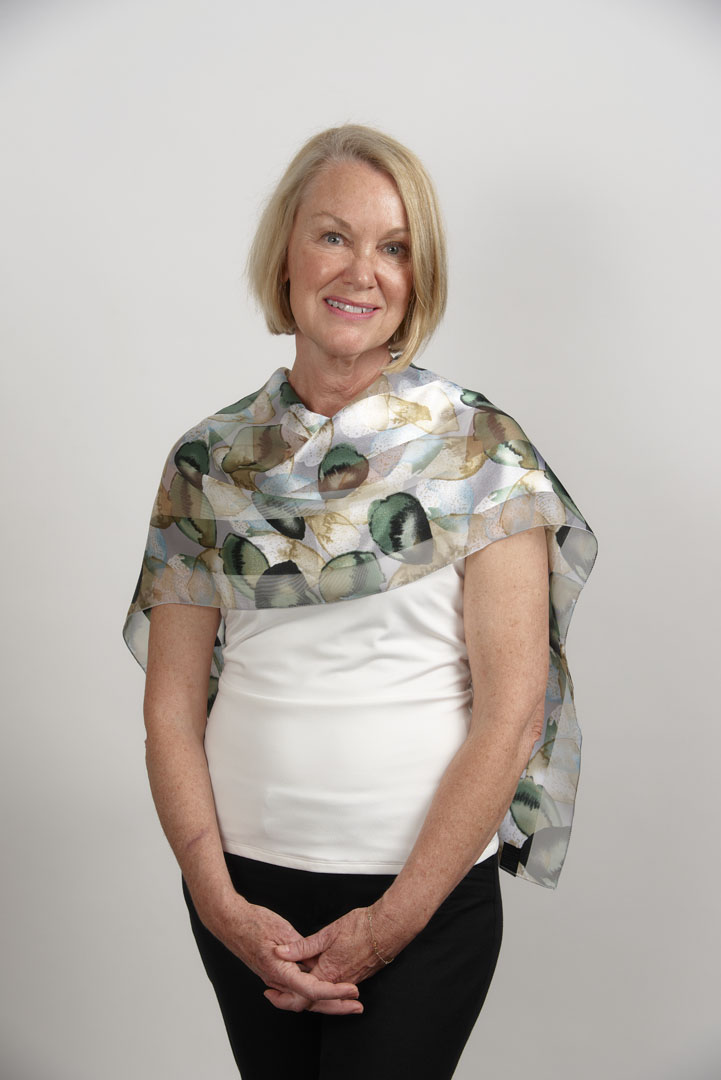
Erica has an extremely fair, cool skin tone, with light turquoise eyes and smooth, auburn hair. There is a clear contrast between the color values of her skin and hair.
Although this blue picks up Erica’s eye color, the overall print is far too cool and bright for her. The contrast between the blue and her warm hair color is too strong.
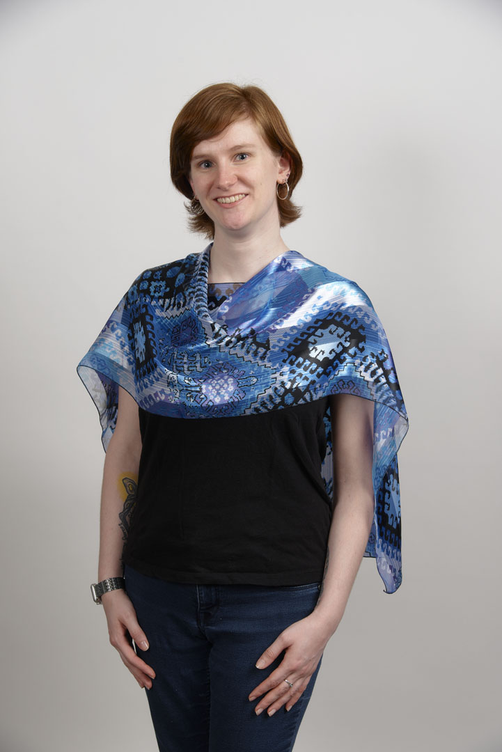
A peachy background with some blue-green motifs presents a good color combination, but the value is slightly too pale.
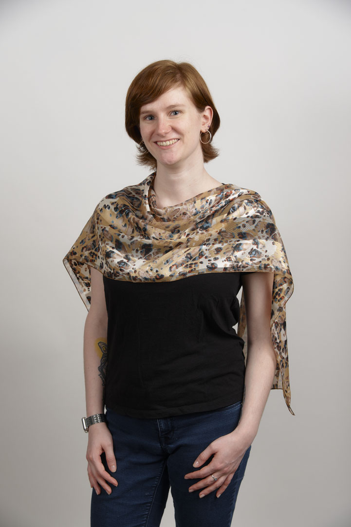
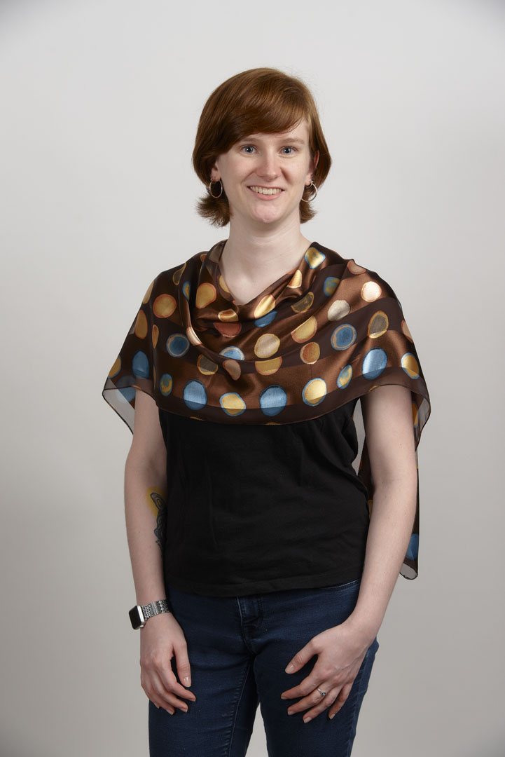
This print is ideal for Erica, in that it contains all her colors and the circular motifs echo the smooth line of her hair. The motifs are a nice scale for her, as she is petite. The background relates to her hair, and the circles include her skin and eye colors. The level of contrast within the print matches her personal contrast level.
Vicky
Vicky has a deep, rich, even skin tone, a bright smile, and black hair with soft, medium-sized curls. She needs prints with some depth and a touch of contrast.
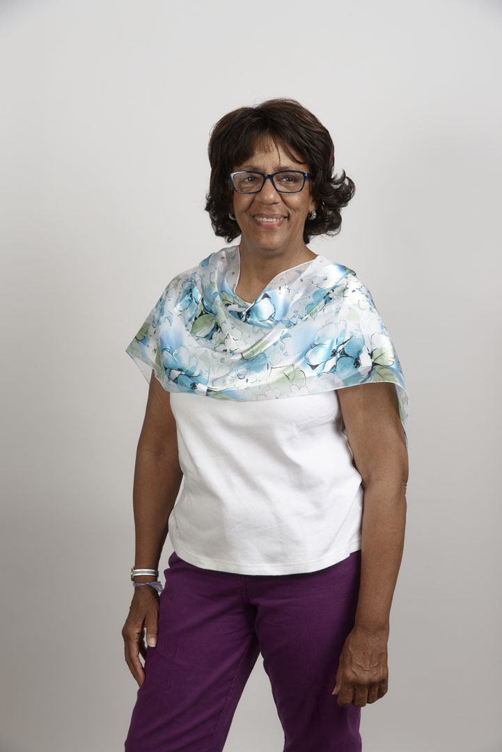
The white background and overall light-colored motifs are much too pale, creating the “floating head” look. The hues generally don’t match Vicky’s coloring.
This print brings in elements of her skin and hair colors, and the shape of the darker motifs reflects her curls. However, the light background again doesn’t have a deep enough value and seems dull against Vicky’s coloring.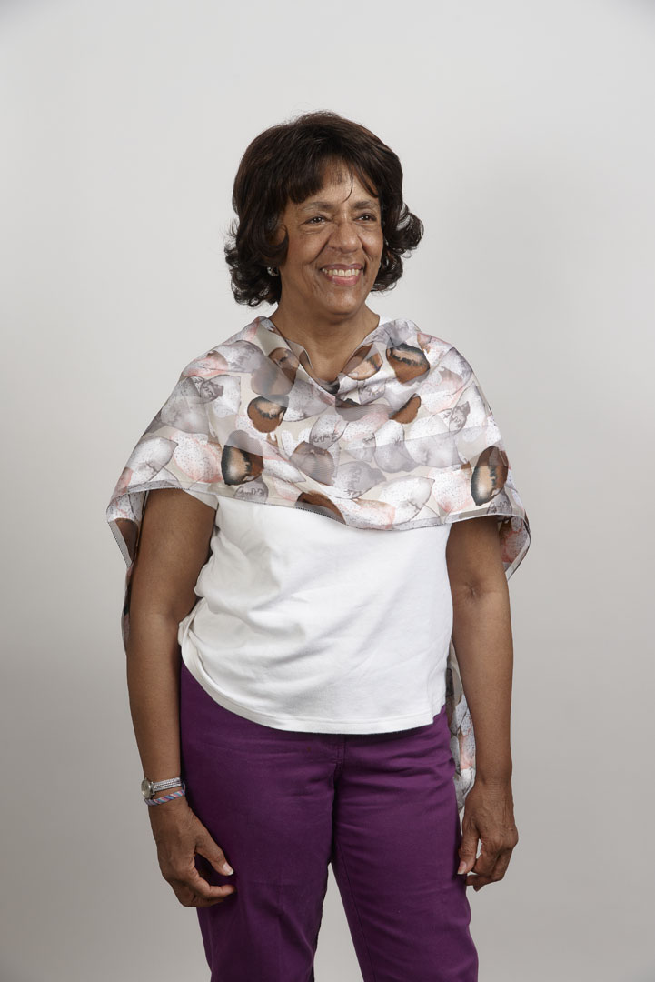
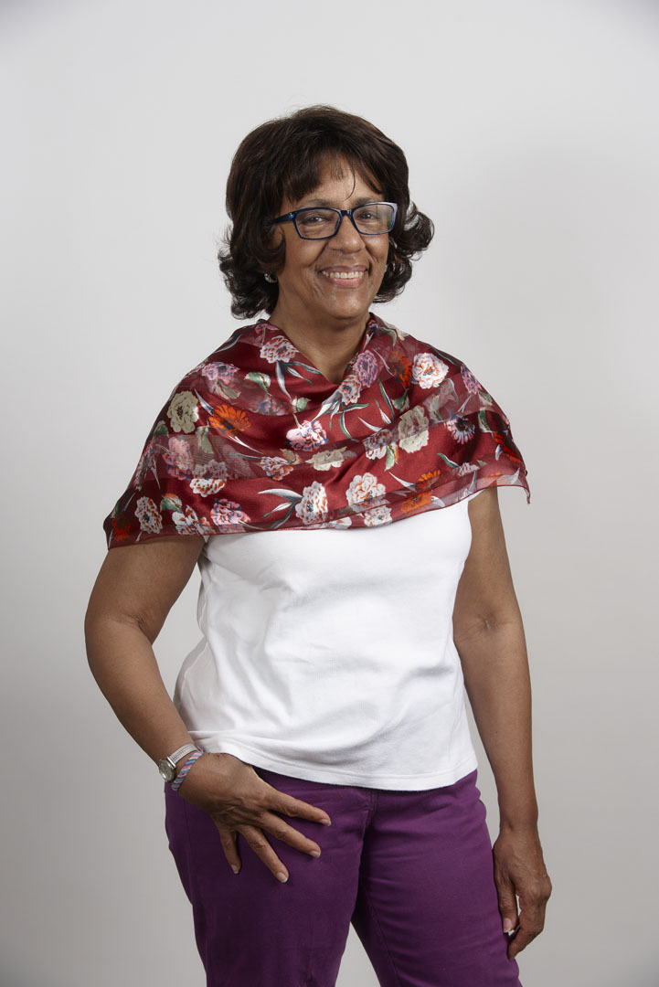
Here, the berry color is cool and rich, like Vicky’s skin and hair, and brings out a rosy glow. The motif shapes echo her hair. The fabric’s shiny texture is a pretty match to her smooth skin.
Yen
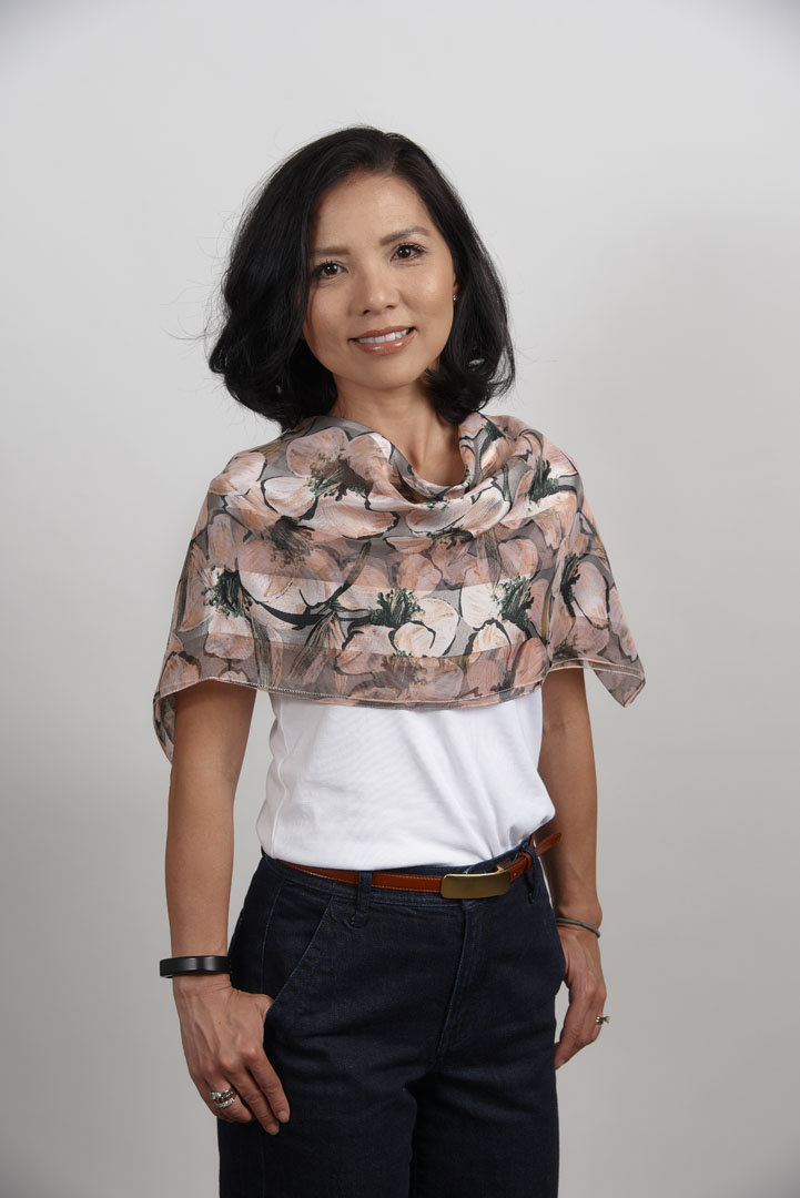
Yen has a pronounced contrast level between her cool skin tone and black hair. She can wear prints with more contrast than many women.
This sophisticated gray, white, and sage print is too pale and muted. There’s not enough contrast to match Yen’s own contrast. In general, it’s ideal to choose prints that don’t have a higher contrast level than your own level, but as this shows, it’s equally important not to go for lower contrast levels. This print would work well on a woman whose hair has begun to lose pigment; the muted colors would reflect a mid-range hair color beautifully.
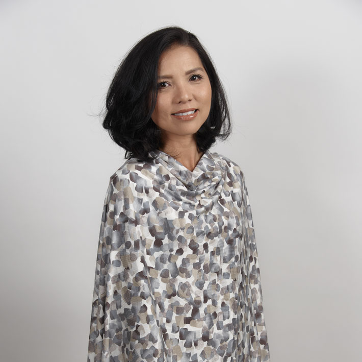
The colors are appropriately cool, and the dark/bright contrast is a nice match to Yen’s personal contrast level.
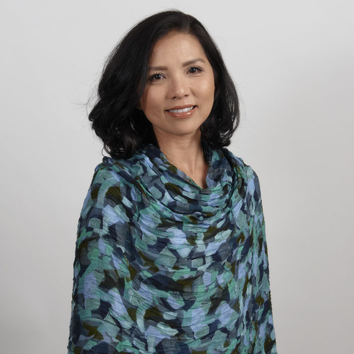
This print has the ideal light/dark contrast level, and the hues echo her skin and hair colors. The curved black motif outlines relate to her hair style, and the shiny fabric adds a brightness that relates to her coloring.
Laura
Laura has a lovely combination of bright, cool skin tone with soft, curly hair in a slightly muted deep brown.
The dominant orange and hot aqua colors are much too warm for Laura’s overall cool coloring, even though the blues bring out her eye color.

There are lots of good colors in this print, including the pink and berry hues that reflect her rosy skin and the blue colors that relate to her yes. However, the greenish-gold elements make it still somewhat too warm.

This color combination is similar to the previous one, minus the warm green/gold, and it is finally cool enough for Laura. The fine lines within the larger motifs create a visual effect that reflects the texture of her hair.
Once you’ve learned to select prints that look great on you, Insiders can find out how to mix and match, with “Kenneth D. King’s Print Mixing Principles.”
Insider members can learn techniques for placing prints in the most flattering way, through easy draping techniques, in Threads Digital Ambassador Becky Fulgoni’s “No-Rules Draping, Part 2: Print Placement.”
Photos by Mike Yamin.









Log in or create an account to post a comment.
Sign up Log in