
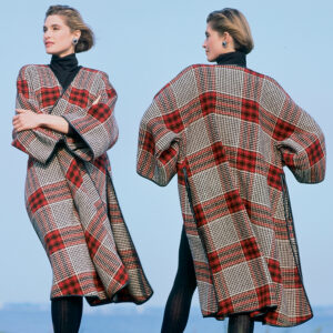
I seem to have breached protocol by being somewhat dismissive of the cover and article featured in the new issue (brightly coloured cover)
To anyone who feels that I was offensive – I apologise – no offense was meant – just airing my personal view – heck isn’t that what everyone seems to do on these pages?
Conversational Threads
Threads Insider
Get instant access to hundreds of videos, tutorials, projects, and more.
Start Your Free TrialAlready an Insider? Log in
Conversational Threads
Threads Insider Exclusives
View All-
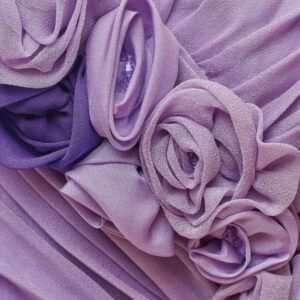
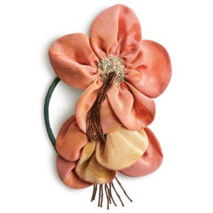
Trending Details You Can Make: Lush Fabric Flowers
-
Sewing with Chiffon
-
Fashion a Magnificent Braid from Bias Tubes
-
Boutis Provençal: Stitch First, Stuff Later
-
Make Tailored Trousers More Comfortable with a Secret Drawstring Waist
-
Reimagining a Couture Look by Galliano
-
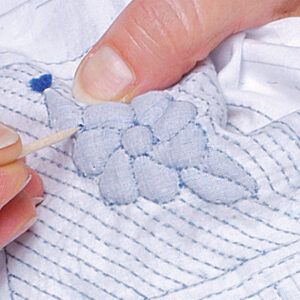
Hand-Sew Collars and Facings for Extra Neat, Sharp Results
-
Make a Statement With Oversized Silk Blossoms
-
Designed for Living, Not for Fashion
-
Pattern Review: Atelier 8 Avril Lapiz Blouse or Dress
-
Pattern Review: Chalk and Notch Isle Jeans
-
Pattern Review: Burda Style Blazer 105 (1050523)
-
Pattern Review: Simplicity 9789 and 9790
-
Pattern Review: In the Folds Sawtell Dress 011
-
Pattern Review: Jessilous Patterns Sunrise Skort
-
A Mending Tool From the Past: The Darning Loom

Highlights
-
Sign up for the Threads eletter
This site is protected by reCAPTCHA and the Google Privacy Policy and Terms of Service apply.See all newsletters -
 Sponsored Content
Where to Buy
-

-

-

-


Replies
i didn't see the posts you mention, and don't even know the title of the thread. but i suppose that since this website is sponsored by the magazine you apparently disagreed with, it would always be wise to act as though you are at a cocktail party where you would not necessarily want to speak ill of your hosts while enjoying their hospitality. disagreements are bound to arise, but handling them with tact, as though the host is within earshot, should help.
Sorry - i forgot that of course others wouldnt see my comment - 'cause it was cut before anyone could - I was just a bit scatheing about the new cover/ article- but as I said - what the heck!!
I don't know what you said, but I probably agree with you. I was stunned by the picture on the cover. That cover would turn me off from buying the magazine. The flowers do not look like something that would be made by adults. I don't care for the fabric choices either. I don't mean to offend anyone. I just don't like the project or the photo. Fortunately, there are some very nice articles in the magazine.
The flower pins are a knock off of pins from the designer Marni, I believe. Fun, but a quickly dated item.
Unfortunately I felt that they were a bit iffy in the 60's first time around!!! - and I know they were supposed to be designer fabric - I just felt they were a little below par for the magazine cover
Interesting. I thought the flowers looked cute. I don't think I'd fuse it like the instructions because the fabric would start to fray (it does a little on the picture). I was thinking that working with just the felt and maybe creating some dimension it might be possible to achieve some interesting effects. Sometimes it isn't exactly what's offered that's most interesting, but the ideas that the examples spark.
Marijke
Yes, there's some excellent content in this issue, but that doesn't change the fact that the cover is not up to Threads's usual standard. What bothers me more though is the censorship. We should be free to express opinions regarding the magazine's content, provided that remarks are not defamatory or abusive. Gatherings provides a forum for the exchange of ideas, for constructive criticism and discussion. We spent many years answering questionnaires, giving thoughtful and informed consideration to the debates regarding the direction taken/to be taken by the editors. We are a lively, enthusiastic group, passionately interested in our subject and the magazine that we look to for inspiration; it's very disheartening to be reprimanded like errant children.
Katina
For what it's worth, I am in agreement with the people who found the cover very unappealing. I thought it looked like some kind of children's craft project and would not have even opened the magazine if I weren't already familiar with it's past quality. It seemed a strange choice for such a "classy" publication.
Hurrah - someone who agrees with what I said in the first post (censored) - vindicated somewhat I feel! Thanks for your post
Hello,
I have just looked at the appalling cover of the latest issue. I did see your original comments (before the banning) and I don't believe that you had/have anything at all to apologize for because your viewpoint was presented without any vulgarities. And, I am in complete agreement (with one of the previous posters) that, as long as we maintain civil standards of communication, disagreements are healthy and should be permitted to be expressed. ATTN: Thread Editors: Why should any of us hesitate to say something or present our point of view?
Julie
P.S. I, too, am probably going to be banned for saying what I just did but so what!!!
Many of us, including myself, have lambasted this publication on many an occasion and unless you were obscene in your comments I am at a loss as to why they censored you now and none of us have been in the past. I thought that the project was a poor choice for the cover too.
I think that when Threads started to use models on its covers instead of textile artisans or the textiles themselves is when Threads started to go downhill. I find the last cover really insipid. Not only that but several months ago we were invited to view on line a video of a photo shoot for the pictures accompanying the Susan Khalje Chanel style jacket article and all I could think was what a waste of money, time and effort. Look back at the original Claire Shaeffer article on this technique! You won't see any such nonsense and it isn't necessary. Is Threads a fashion magazine or a sewing/textile art magazine? I think those of us who love the old Threads did so because it was a textile art magazine. Furthermore, it was an inspiration to us to learn new skills, try new techniques and expand our horizons with new design ideas. No more. I've not renewed my subscription and I rarely even visit this site. However, I cherish my Threads magazine collection, especially the first few years. Let's see how long this post stays up.
I also saw your original post and found nothing wrong with it. In fact I was glad to see someone voice exactly what I had been thinking about the cover. If nothing else, the project was poorly executed — hardly what we expect to see inside THREADS, let alone on the cover. I did enjoy many of the articles in this issue, however, I thought the topic for the "Master Class" was actually very basic. Both the knits article and the embellishment article seemed much more advanced than a tutorial on making lingerie guards, something I learned how to do very early on in my sewing education.This topic seems more suited to the Tips or Q & A sections of the magazine, or to the long lost Basics column. I actually enjoyed the Basics column. It gave me a refresher on basic sewing skills, I often passed those articles on to my young niece who is learning how to sew, and it gave beginners a place to get started in the magazine without allowing the basics to take over the entire content of the magazine. I thought having this column along with the Master Class column (when it presents truly challenging projects or skills) and several intermediate skill-level articles in between was a smart way for the editors to address the needs of people at all different skill levels without dedicating the magazine solely to beginners.I agree with the others on this post that we should be allowed to voice our opinions about the magazine, both good and bad, and that the editors should pay attention. How else are they going to create a magazine that meets the needs of its readers?
"I agree with the others on this post that we should be allowed to voice our opinions about the magazine, both good and bad, and that the editors should pay attention. How else are they going to create a magazine that meets the needs of its readers?"Absolutely.
I want to stress that I have always enjoyed Threads. My reason for complaining is that I really do miss the beautiful magazine that I waited anxiously for every 2 months. I've become increasingly disappointed and am hoping that the publishers will listen to the readers. It just seems to me that "if it isn't broke..don't fix it." I don't think people are just being nasty, I think they are trying to protect something they have become fond of.
I certainly agree that the cover on the current issue is a clinker. Also--the article showing the "Magic Bow" is so old!! I have been using that bow for 20 years. Ever since I cut it out of (ahem)Sew News. I have enlarged the pattern a lot and used it to decorate for Memorial Day in a huge auditorium. So much for something new and exciting. I guess they wanted to give us some ideas for Christmas but didn't do very well. I will always subscribe because I really like to read about sewing and --lets be honest-- Threads is usually pretty good. Evie
Thanks for your mail and further encouragement, helping me to feel as if ive not been a little "out of step" with my thinking!
I too enjoyed some articles in the mag. as I did manage to overcome the annoyance i was feeling re. colour schemes and simplistic nature of the article hitherto referred to.(Gosh that sounds pompous doesn't it!!)to read further.
I would have loved a close -up of the edging to the dress on the back - possible inspiration for my own free-motion embroidery as lace, to edge items. I loved the close ups that used to be on the back cover.
One question perhaps someone could enlighten me on - the fly zipper insertion - is it better now to put the zips in with the top of them going into the waist finishing ?( the article doesn't go into that step!) and me being a little bit unadventurous with some things, still likes to finish a zip with the top stopping before the waist treatment (however i choose to work it!) - are zips that reliable over the pond that it does not need to go right up to the top stops?
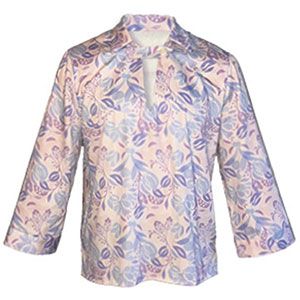
I loved the shape of the reverse applique waistcoat - page 59 - but as i don't use fusibles that much on knitted fabrics for wearing - by that I mean i dont make that many! - would this design stay in place when wearing? Is your Therm o Web HeatnBond such a good product? If so i will have to find a supplier for the UK!
History of iron was possibly of some use to me in school - pity lots of the makes are not the same over here!but the time line is good!
Anybody had much success with gloves? - Pge 25 pattern
I haven't - and i would not advocate my students in school trying to make them - 'cos they are a "swine" to do every time - if anyone tries this pattern out i would appreciate some advice as to how successful it can be- and helpful hints to ensure a success with students!!
Gosh - this is a long post! Winding down after a sh...y day at school!
Thanks SAAM for your reply - Janet
I have to agree with others here who have said the most recent cover is not appealing at all. It looks crafty to me and not something I would buy. I feel like we are being told that we are too old and out of style to dictate what we want in Threads. Is it really that difficult to produce a magazine as good as it once was? If this continues, I will have no reason to renew my subscription. That makes me sad.
When you consider how much time was spent ( years actually) conducting surveys of longtime subscribers, how carefully and thoughtfully we responded to discussions initiated by editors here in Gatherings, and how genuinely we care about the magazine, it is indeed very disappointing that all seems to have been in vain. It's been said before - perhaps Taunton could introduce a second magazine with more emphasis on those who might be more interested in becoming proficient in the basics of sewing. It is really sad, yes.
Gee whiz everybody, chill. Nobody's perfect. A magazine can't be everything to everybody. Those of you with constructive criticism, keep at it. Maybe things will change.
Actually - you echo what I said - so why my comments were censored i dont know - but heigh -ho - vindicated by what others say I think and i will try to be always positive when I next comment on the cover!!
Be interesting in a way to see if "impulse buying" of the mag is down for this issue 'cos it would have turned me right off seeing it on a shelf in the shop!
I saw your original post - went to the website to look at the cover and "gak". I'm already peeved that Threads is now about sewing, not the wide range of fibre arts it used to cover - that cover is definitely not going to inspire me to pick up that issue. Seems like the mag's gone to gluing, not even sewing.
I'm another who didn't see the offending post, but have to give you my wholehearted support. I see no reason for censorship if your response to the cover was presented in a civil fashion.
For what it is worth, I was appalled when I saw the cover of the current issue. It is a good thing that the content of the magazine is good, because I certainly wouldn't have even given it a second glance had I not already been familiar with Threads. I am at the stage where I peruse the magazine before I buy (I have been disappointed with its direction and focus these last few years), so I was looking for it. This cover would not otherwise have induced me to pick it up off a newsstand.
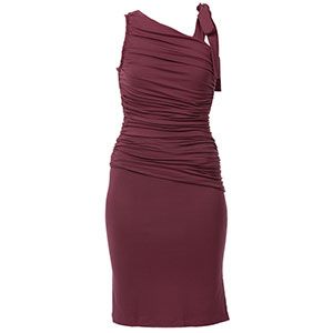
I read many pleas for Threads to bring back the beautiful covers with vintage articles. It took me a few minutes to figure out why this back cover just did "nothing" for me. I pulled out my old magazines and then saw that the old ones featured a really tight close-up of some gorgeous detail and there was only a small photo of the entire garment. The current one just has a so-so photo of an old dress. If it has any lovely detailing we can't see it. I would really like to know if you think I am being unfair. Do you think it's as interesting as the old ones? If others think I am being too harsh, I apologize in advance.
I think you're dead-on in your assessment. I'm a subscriber from way back - I have all the issues from #15 on, with the exception of a few recent ones that I decided not to buy because they didn't do anything for me. I was one of those pleading that Threads continue its focus on advanced techniques. I so much miss the back covers of the old days. And not just the fabulous detail shots of amazing garments. Once upon a time, other inspirational photos were published here as well - a miniature sewing room, art quilts and wall hangings, thread paintings, sculptures of dancers made from nylons, garments made from cast-off material (trash)....the list goes on and on. And all of it inspirational in some way. The back covers of recent issues leave me cold by comparison. True, the fabrics are beautiful, but that isn't enough for me. I want something to strike a chord of amazement in me, the "wow, look at that!" sensation. I realize how difficult it can be trying to please everyone, but surely it can be done better than this, can't it?
Well I did not see the post you spoke of but I knew exactly which cover you were talking about when I read it (it looked more like a Sew News cover). I too was sorely disappointed in the type of project featured. Perhaps Threads should start a sister magazine with other "different" projects. I am glad they are increasing their readership base, but they should keep the intermediate and advanced sewer's features that previous editors cultivated.
I too did not see the original post. Had I seen this post I most likely would have chimed in as I am now doing. The cover for this current edition of Threads was a disaster. I thought the same for one several editions back with the elf-like shoes on the cover.
The back covers now seem to leave much to be desired. There was a time when the back cover of Threads would make one desirous of investigating further both the fabric and construction of the garment. This last one seemed to be a ho hum Martha Washington dress (I have nothing against Martha Washington, just this boring, non-inspiring cover).
Too, like some of you, I do hope the editors, advertisers, and investors are listening to what the Threads' readers and members of this forum are saying whether or not they like what's being said about the magazine and its content (lack of in some cases), as they know where the profits comes from...
Also, like some of you, I long for the 'exciting' articles like the early Threads magazines carried. Those magazines are the ones where you really could learn some new techniques, get an inspiring ideal that set off the adrenalin and the desire to make something not only worthwhile, but out of the ordinary. Short of articles by Claire Schaefer, except a recent one about the museum, I'm not learning much that is new and inspiring when reading Threads magazine.
Finally, what I question is what direction is Threads taking, particularly with the new magazine coming out in February. Let us all hope that this magazine - be it a single edition, or a tester for things to come - will be one that is for the sewists that desire to go beyond the basics.
Threads used to inspire me to kick my sewing up a notch with the excellent technical information on imtermediate and advanced techniques. In the much older issues they devoted twice the number of pages to a featured technique (lesson).
I am glad that Threads is appealing to new sewers, we do have to attract new sewers for sure, but they should ADD the info not take away the important features that we love so much!
Not only did they devote more pages, but there was A LOT less white space on each page, the font was smaller and the space between rows was smaller, the size of the magazine was larger. You had to actually READ. now a days its just look at the pictures.
This post is archived.