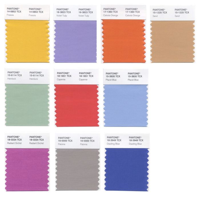
The women's color palette for spring 2014, from top left: Freesia, Violet Tulip, Celosia Orange, Sand, Hemlock, Cayenne, Placid Blue, Radiant Orchid, Paloma, and Dazzling Blue.
In the Northern hemisphere, spring is slowly making itself felt in small ways. Slightly warmer weather. Longer stretches between freak snowstorms. The reappearance of migratory birds and their pre-courtship behavior. Snowdrops peeking out from under random, still-unmelted mounds of snow. Spring’s tentative first motions are beginning to inspire me to think of my spring and summer sewing and of refreshing colors I want to try. How about you?
It’s the perfect time to take a look at the colors that fashion designers used in abundance in their spring fashion shows of last fall. And, as usual, Pantone (which tracks color trends globally) is our source for the season’s most prevalent colors. These are the colors you’ll see in clothing stores, as well as fabric stores in the coming months; you may already have seen them, in fact.
The good news is that fall 2013’s unisex, neutral-based color palette has been replaced in spring 2014 with a modern blend of pastels, soft neutrals, and bold hues. According to Pantone, both the women’s and men’s spring color palettes reflect consumers’ continuing need for stability alongside versatility. Also according to Pantone, spring 2014’s colors readily combine with each other, as well as with many other colors that may already be in your closets (or fabric stash).
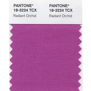
On the women’s spring 2014 color palette, three pastels and two neutrals provide a counterbalance to five bolder hues. The 10 colors are: tranquil Placid Blue, verdant Hemlock, romantic Violet Tulip, lightly toasted Sand, dove-gray Paloma, spicy red Cayenne, tropical yellow Freesia, vibrant citrus Celosia Orange, luscious Radiant Orchid, and energetic Dazzling Blue.
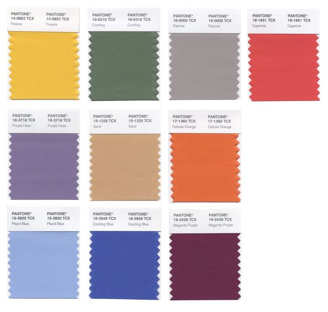
The men’s spring 2014 palette, while incorporating only one pastel, blends deeper, more muted shades of the women’s hues with some of the same bold colors. Paloma, Sand, Placid Blue, Cayenne, Celosia Orange, Freesia, and Dazzling Blue are joined by mysterious Purple Haze, evergreen Comfrey, and robust Magenta Purple.
Do any of spring 2014’s colors appeal to you? I must admit that I’m partial to Cayenne and Radiant Orchid from the women’s palette, but also to Purple Haze and Magenta Purple from the men’s palette. As always, bright yellows leave me cold.












Often I try to explain color value to friends. This is a great example. I guess the number of combos are 10C2. Capiche?
If these are good colors for you great if not why waste your money. To me our best colors do not change but the fashion industry wants us to be jumping through hoops to be in style.
Where are all the beautiful shades of turquoise that I'm seeing in all the stores in new styles coming out just now? I really wonder how much these color and fashion industry people pay attention to each other.
These colors are awful! So dull and murky. Nothing like Spring and they would look terrible on me. Disappointing. I wouldn't wear any of them.
I hate those colors, too. Well, not the colors, exactly, but what they've done to them. Dull, boring blue, green, red, gray, and mustard. YUK. I'll just see if I can find colors that look good on me, and use those, as out of style I'll be. LOL